Hi, I'm Laura!
Let's take action and accomplish goals bigger than ourselves.

For my Barrett Honors thesis, I aimed to leave a lasting mark at ASU.

As a weekly exercise, a user experience class activity prompted new design solutions to combat user experience issues in each technology.
My UX evaluation and mockups of this website enhanced the resources available to students for food equity, accessibility, and sustainability.
I have explored my design skills within different facets from educational design or professional design, or just for fun. Check out my visual designs!
I created a personal website to showcase all my work, from human factors research to visual communication. Explore my site to learn more about me!

Inspired by "A Work-Centered Approach to System User-Evaluation" by Roth (2021) and UX design principles, this thesis project aims to determine the usability levels of the ASU Class Search System to locate pain points and provide appropriate recommendations. The ASU class search system allows students to complete the necessary tasks, but the user experience is frustrating due to unnecessary scrolling, clicking, and searching.
The user evaluation confirms that some improvements could be made to the class search system to improve its utility and usability. The main improvements suggested in this work address filter and navigation inconsistencies, an overwhelming negative space, minor design inconsistencies, minor jargon and content inconsistencies, scroll stoppers, and guide support.

To optimize the process flow, consider the following enhancements for a seamless transaction experience:
Tap payment options are recommended for further convenience, but a machine upgrade would be required.

Optimize portability and digitize the design by downsizing overall dimensions and reducing space occupied by ads and ratings for improved maneuverability:
Consider utilizing fonts like Helvetica or Verdana for the title to enhance readability.
The current elevator button set presents ambiguity, potentially causing user navigation challenges. To improve the user experience:
These modifications will provide a more user-friendly and inclusive elevator interface for a seamless and accessible experience.

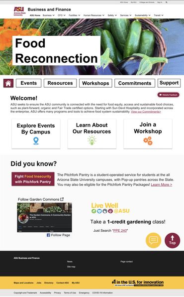
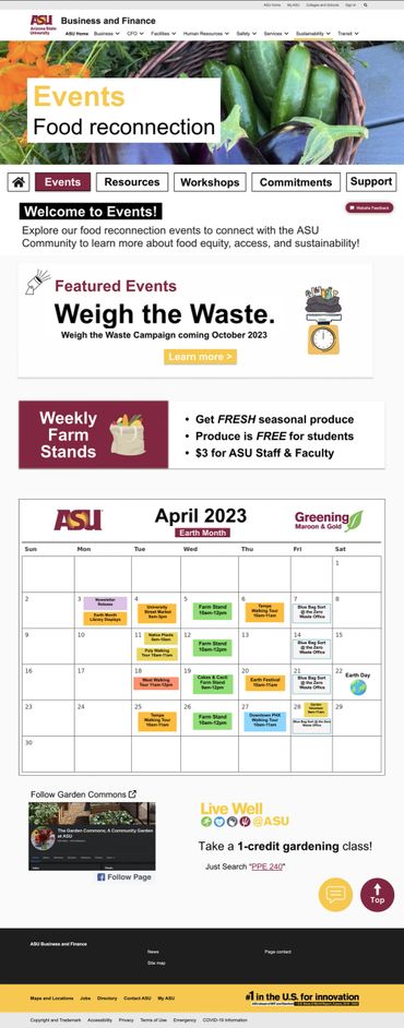
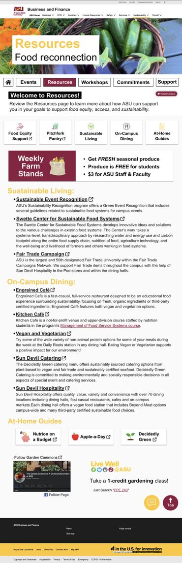
The ASU Food Reconnections page provides a variety of links and resources for the ASU community to connect with, including food equity, accessibility, and sustainability; however, after a preliminary user evaluation, it was found that the Food Reconnections page would benefit from improvements related to content organization, visual web elements, and accessibility tools. Explore below to see the wireframes and mockups addressing the pain points or view my research plan for more information.

A study conducted by the HOPE lab in 2018 found that 36% of college students struggle with food insecurity. ASU’s Sustainability Practices (USP) Food Reconnection program aims to offer resources to food-insecure students; however, its current layout appears text-heavy and preliminary research found that to be a deterrent for most students.

In addition, the lack of more straightforward navigation and the absence of engaging website elements does not support site engagement or navigational guidance. Its layout, rhetoric, and lack of scannable elements prevent students from engaging.

The current Food Reconnections website also includes poorly embedded resources without a thorough indication of external navigational pathways, which may mislead users and further stray them from their primary goal.
See the recommended solutions below.

Changes present in my sketch boards for the new Food Reconnection homepage include:

I expanded the Food Reconnections page in my sketch boards in order to:
In an attempt to make the site appear more interactive, my sketch boards include:
See my redesigns below OR view them on Figma!

It is an honor to receive this award in recognition of the work I produced in the last year of my undergrad. The summer before senior year, I made a bold decision to shift my career goals toward a field that was nearly 100% foreign to me. Looking back after graduation, I have no regrets. I am proud of my accomplishments, the things I learned, and the person I’ve become.

GoDaddy has recently transitioned towards a mature and entrepreneurial persona, but this came with the loss of its Daddy. I believe we should revive Daddy from the logo heaven.
I designed new logos for GoDaddy. One Daddy dawns the GoDaddy Star and the other has the GoDaddy heart.
Check out my memo to learn more about how these new daddies came to be.
My favorite design project so far was using my design skills to create jungle-themed food tags for my nephew's birthday party. View the other food tags on my Behance!

In a Visual Communications class, each module explored a different design color to challenge and prompt us to explore how different colors can influence our designs. For the color blue, I drew inspiration from Katsushika Hosukai's The Great Wave Off Kanagawa to reimagine Hokusai's website, showcasing the artist's legacy and life's work. I used a mid-fidelity wireframe to display design recommendations for the website's landing page and information architecture.
The wireframe uses a grayscale, and I wanted to go further and revamp the website's color palette. Drawing a soft pink and cream color from Plum Blossoms and the Moon, the currently featured piece on the website, then a Prussian Blue of the wave and the soft orange from the canoes in The Great Wave, I developed a new color palette.